🚀Bitcoin Breakdown:
Welcome to Bitcoin’s 4th Halving Event, a 50% collapse in mining supply that occurs every 4 years. But this particular halving cycle is quite special for a few reasons, but one personal favorite is when the halving takes place around April 20th (@ Block: 840,000), we will witness Bitcoin becoming scarcer than its predecessor, which is gold (see figure below).
Charts made with gnuplot and gnumerics
Now, before I set you up with my all-time favorite Bitcoin-related charts and/or tools, I deem it necessary to summarize the Bitcoin Halving fundamentals. View the explainer video and/or figure (below) to get a better feel for “What is Bitcoin?”

This is the E = mc2 of Bitcoin #RevolutionaryMathematics
Every 210k blocks, the Bitcoin supply gets cut in half. When Bitcoin came online, the subsidy for every block (averaging roughly 10 minutes between blocks) was set to 50 Bitcoin. This reward of 50 Bitcoin was given to whichever Bitcoin miner, mined a Bitcoin block. Said another way, the incentive for using electricity to mine Bitcoin was initially rewarded 50 Bitcoin per block.
The subsidy and/or incentive for mining Bitcoin remained the exact same number for 210k blocks, which calculates to about 4 years in length. Each 210k blocks, the subsidy and/or incentive reduces by 50% every 4 years . Here is a clearer breakdown…
Halving Cycle History:
Halving Cycle #1
Halving Cycle #2
Halving Cycle #3
Halving Cycle #4
Halving Cycle #5
Date:
November 28th, 2012
July 09th, 2016
May 11th, 2020
April 2024 (this month !)
Sometime in 2028
Block Height:
210,000
420,000
630,000
840,000
1,050,000
… rinse & repeat until 21M.

This being my 3rd halving cycle, I think what many people miss the forest for the trees. Many individuals miss realizing the true power of Bitcoin. Whoever has done the work by studying Bitcoin has never turned “unbullish” on how Bitcoin can benefit humanity. But once everyone else slowly puts in the work for themselves, the demand will only increase for Bitcoin, but sadly the fixed Bitcoin supply won’t wait for ignorance to catch up. Supply is ever diminishing, and demand exponentially increasing. It is an absolute privilege to front-run institutions while simultaneously exchanging fiat for sound money. Buying Bitcoin with my United States Dollars or my Euros, is a transaction I am grateful for. For many others who lack such a privilege, tend to use Bitcoin out of necessity. Therefore, I not only “HODL” (Hold On for Dear Life) for myself or my future children, but for those that need monetary stability in the lives. There will only ever be 21 million Bitcoin, if you simply HODL and use Bitcoin as savings technology, and every other Bitcoin HODL’er does the same, then stability can eventually be reached, for everyone. For miners, the incentives comes with price appreciation, for others it’s stability and consistency, which garners trust. So whatever Bitcoin means for you, at the end of the day, your choice to use Bitcoin directly impacts the entire Bitcoin community in some capacity.
Now lets dig into my personal favorite charts….
Introduction: A Few Chart Favorites Explained
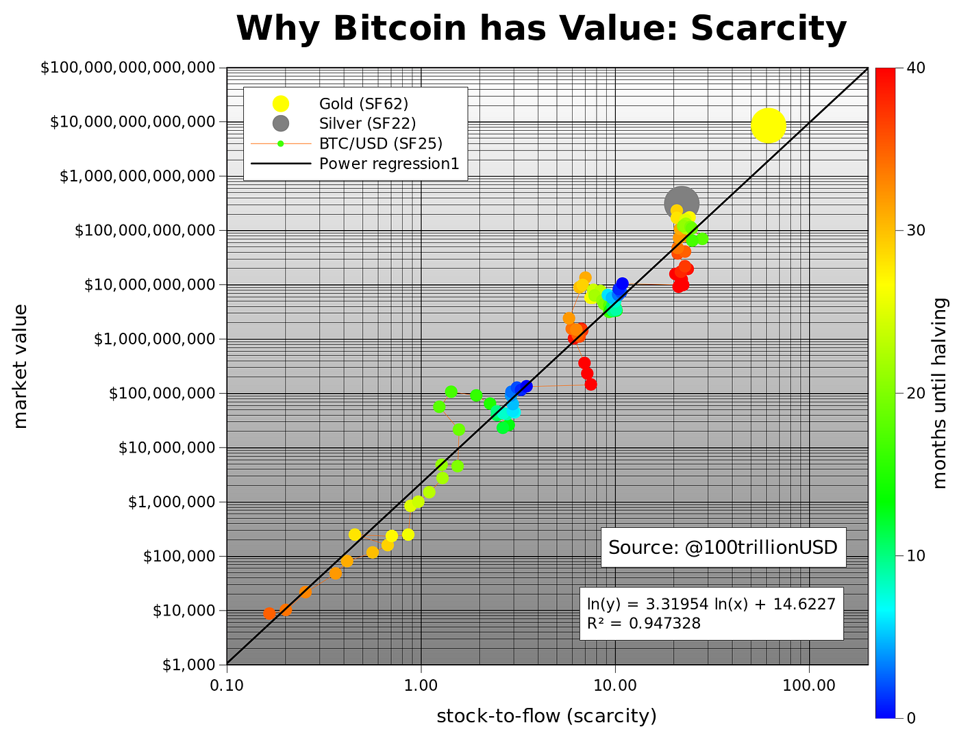
Chart #1: Stock-to-Flow by Plan B (Twitter: @100TrillionUSD)
There is great debate within the Bitcoin community about Plan B’s Stock-to-Flow chart, but I personally am a big fan. Out of great curiosity, Plan B, an anonymous quantitative analyst gave color to this idea by creating his infamous “Stock-to-Flow” chart (S2F chart) on March 22, 2019 (see figure below). It was the chart I used back in March 2019, that guided an important part of my Bitcoin accumulation journey. Why? Well, if Bitcoin is perceived as “Digital Gold” and/or as a commodity asset like gold or silver, and both gold and silver have a stock-to-flow component to them, then too might be the case for Bitcoin (the verdict on this is still being defined).
Effectively, Plan B modeled a relationship indicative of power law dynamics based on how much Bitcoin is produced, against how much Bitcoin is demanded. In 2019, the original (not S2FX chart) predicted a Bitcoin market value (i.e. market capitalization) of roughly $1 Trillion post-halving, amounting $55k price tag per Bitcoin. His reasoning for how we’d reach this amount is via “silver, gold, countries with negative interest rate (Europe, Japan, US soon), countries with predatory governments (Venezuela, China, Iran, Turkey, etc), billionaires and millionaires hedging against quantitative easing (QE), and institutional investors discovering the best performing asset of the last 10 years” (PlanB, 2019). Giving credit where credit is due, this article was established when the Bitcoin price was only around $4000, and by the end of Bitcoin’s 3rd halving cycle, we exceeded Plan B’s estimated $55k price tag, ending Bitcoin’s third epoch as high as $69.5k. This is around the current price today (March/April 2024 at the time of writing). What a ride it has been in-between!

https://planbtc.com/ (PlanB, 2019)

The reason I value PlanB’s S2F Model (stock / flow), is because the aim was to quantify the “hardness” of Bitcoin in relation to other scarce assets. When it comes to monetary attributes, the hardness (meaning “hard to produce” and/or “resistant to debasement”) of money is its most important attribute, whether tangible or in its physicality.
The easier money is to produce, the less desirable it becomes. Therefore, the “stock” refers to availability, whereas the “flow” represents new supply (added from production or other sources. PlanB’s S2F Model ratio’d Bitcoin’s annual supply growth (which is cut 50% every 4 years) to its existing supply (which ebbs and flows with demand). So PlanB’s model suggest that a high S2F is when annual growth is small relative to existing supply. A low S2F suggest that annual growth is big relative to existing supply. The aim is to find assets with high levels of stock-to-flow, because low stock-to-flow can easily influence overall supply and price, which isn’t the most viable option for a store of value asset.
This leads me to another favorite chart, that gives another perspective to annual supply growth in relation to existing supply, entering the chat is:
Chart #2: The HODL Model by Rational Root (Twitter: @therationalroot)


After Bitcoin’s 3rd Halving Cycle was near its completion, an inflection point occurred. Bitcoin’s illiquid supply began to outpace the rate of new supply issuance. Why does this matter? Of course not financial advice, but, as the Bitcoin narrative as a store of value continues to gain appeal, it could become the dominant long-term savings vehicle for many. I am personally in this camp. Bitcoin is my bank.
This Bitcoin Halving Cycle (beginning around April 20th, 2024), as Bitcoin’s coin issuance drops by 50% from 6.25 to 3.125, and a 50% reduction every halving after, the demand (from retail, institutions and sovereign nations, etc.) seem destined for demand to continue to outpace supply. With an absolutely scarce asset, there will only be so much to go around. It literally is an asset that is acquired on a first come, first serve basis. Is that fair? Debatable. But according to The HODL Model, expect the unexpected this cycle.
As I am now speculating, maybe we could’ve ran even further in 2021, if it wasn’t having to battle both the China mining ban & the FTX debacle (Google both if unfamiliar).
However, everything that aims to destroy Bitcoin tends to only make it stronger. The China mining ban decentralized the Bitcoin mining industry. At the time, China centralized nearly 50% of all Bitcoin mining at the thanks to cheap electricity cost. China’s loss has become the United States of America gain.
The FTX collapse woke up the masses to STOP TRUSTING EXCHANGES TO HOLD YOUR MONEY FOR YOU (!), and instead take responsibility into your own hands. Self-custody YOUR property! This point cannot be stressed enough! Fast-forward to today, I am of the opinion that the FTX collapse was one of the greatest things to ever happen to Bitcoin’s ecosystem, although way too many people lost their life savings. Why might I think this? Because the ethos of Bitcoin is to take responsibility over your assets. Bitcoin held on exchanges can be manipulated, and that manipulation ceases to exist when your Bitcoin safely rest in cold storage (other words, your own possession). I digress, but before i do, please folks… Know what you own!
Chart #3: The Wall Street Cheat Sheet - Psychology of a Market Cycle
A self-explanatory chart that simply captures the emotional rollercoaster of humans and markets. Each step, a typical trend step that plays with perceptions and behaviors of market participants. I encourage two things for turning this chart into value: 1) Study Business Cycles & 2) When looking at any chart, try to pinpoint where we may be in Market Cycle Psychology (using this cheet sheet, of course).

Chart #4: The Bitcoin Spiral by Rational Root (Twitter: @therationalroot)
This chart is inspired by both PlanB’s Stock-to-Flow model & The Wall Street Cheat Sheet (Investor Psychology). This chart is my Chart #1. It combines practically all listed charts into one. If you study this chart, it speaks volumes if you pay close enough attention: Peaks, Troughs, Best Time for DCA, Emotion (Investor Psychology), etc.

https://www.bitcoinstrategyplatform.com/cheatsheet/ (Root, 2024)
“Key Insights:
Non-Crossing Lines: Observe the lines weaving through the chart. They never cross, signifying Bitcoin's consistent pattern across four-year cycles.
All-Time Highs (ATHs): Marvel at the blue dots, almost exclusively clustered in the first quadrant, except for Bitcoin's inaugural cycle, which was understandably compact due to the absence of price data.
Cycle Peaks: Note the bigger blue dots around Christmas every four years, marking the alignment of cycle peaks.
Cycle Troughs: Spot the prominent red dots in the southern region of the chart, representing the cycle troughs that occur approximately one year after their corresponding peaks.
Halving Milestones: The big green dots denote each Halving event. These green markers shift slightly every four years, due to Bitcoin's Halving occurring every 210k blocks (slightly less than 4 years)” (The Rational Root, 2023).
Chart #5: The Bitcoin Network’s Timechain Calendar by TC

https://timechaincalendar.com/en (TC, n.d.)
The Timechain Glossary:
Prerequisites: The Bitcoin Network’s Timechain Calendar is a learning mechanism through which you visually learn about the underlying mechanics of the Bitcoin network.
Price Information:
“Exchange” - This data represents the current price for 1 Bitcoin.
“Sats / USD“ - This data represents the how many sats you’d reason today if you exchanged $1 for satoshis (sats).
Note: 1 Bitcoin = 100,000,000 sats
Market Cap (in USD) - This data represents the how many total dollars (measured in USD) are circulating through the Bitcoin network.
Current Block Information:
Block Height - Roughly every 10 minutes, a new set of transactions are added to the Bitcoin blockchain. The block height is a history of the total number of Bitcoin blocks that have officially be mined. It is a permanent fixture as the entire network centers around mined Bitcoin. It help to orchestrate movement of the coins on the network.
Note: Every 210,000 blocks per Bitcoin halving. At 840k, we are due for the next.
Moving north of the Bitcoin Block Height…
Average Block Time; (Example: 9m 55s): This data represents the average time it has taken to mine a Bitcoin block during this current Bitcoin adjustment epoch (currently Epoch IV (4) as shown in the Top Left corner of the Timechain Calendar).
Note: A good rule of thumb is to use the magic number of 10 minutes per block as your compass.
Faster than 10 minutes mean more miners are mining. Slower than 10 minutes, mean miners of shutting down power. This is where the difficulty adjustment finds its significance (continue reading below).
The Difficulty Adjustment; (Example: 0.89%): Roughly every two weeks a difficulty adjustment on the Bitcoin network occurs. The percentage gains or losses are determined by the average block time.
When the Bitcoin network notices faster average block times, the difficulty adjustment will show a positive gain. A positive gain (currently showing 0.89%) would indicate greater difficulty and/or tighter monetary policy (if this were a Central Bank), and would occur over roughly the next two weeks when mining Bitcoin blocks.
When the Bitcoin network notices slower average block times, the difficulty adjustment will show a negative loss. A negative loss (for example: -7.83%) would indicate diminishing difficulty and/or looser monetary policy (if this were a Central Bank), and would occur over roughly the next two weeks) in mining Bitcoin blocks.
The difficulty adjustment, in my opinion, is one great innovation surrounding Bitcoin’s innovation, as it maintains consistency within the Bitcoin ecosystem.
Last 24 Hours; (Example: 84 / 144): This data represents how many blocks were mined per 24 hours. The denominator is used the target (currently stands at: 144). If the numerator is higher than the listed denominator, then it logically may indicate faster than the average block time. If the numerator is lower than the listed denominator, then it logically may indicate slower than the average block time.
Moving south of the Bitcoin Block Height…
# MINS AGO; (Example: 30 MINS AGO): This data represents a time reference for when the last Bitcoin block was mined. This is a cadence that can vary throughout the day.
Note: You can click the pop-up icon, to be led to other websites that can also show you Bitcoin block visuals ( mempool.space or Bitfeed.live).

Mempool.Space is awesome sauce btw!
# TXS; (Example: 322 TXS): This data represents how many total transactions entered the previously (last) mined Bitcoin block.
# MB; (Example: 1.43MB): This data represents the total size of the data that entered into the last mined Bitcoin block. “MB” stands for megabyte(s).
AVG # s/vB; (Example: 8 s/vB): This data represents the average total cost in fees that Bitcoin consumers are paying to send money around the world. The “s” represents “sats” & “v/B” represents “virtual“ “Bytes” of data they are attaching to the Bitcoin blockchain.
Note: This estimated average only pertains to the previously (last) Bitcoin block mined.
FEES - SATS/vB
Priority; (Example: 19): This data represents a fee (#) estimate on what fee is required to guarantee access to be entered into the next block (highest bidders win). Typically those in a rush may be more willing to pay higher fees.
Anytime; (Example: 6): This data represents the fee (#) estimate on what fee is required for those less in a rush. If you are just simply moving your stack to cold storage, time in on your side. Therefore, you might be better off exercising patience, to save on unnecessary transfer cost. Once you see that your transaction shows up on the blockchain, you can basically guarantee it’ll reach your chosen destination, eventually. Patience is a virtue.
Purge; (Example <2.03): This data represents the threshold fee amount, that if beaten out by other higher bidders, may bump you out of the mempool and returned to the sender’s wallet (starting point). Then you’d have to execute the origin transaction again from scratch.
Note: All three of these statistics are the estimates for only the upcoming (next) Bitcoin block.
Mempool
Inflow; (Example: 788 vB/S): This data represents v/B per second. It is how much new information is being relayed to people’s mempools every second.
Unconfirmed Transactions; (Example: 119127):This data represents the amount of transactions piling up waiting to be mined in subsequent blocks.
Depth; (Example: 166): This data represents roughly how many blocks worth of transactions are waiting to be confirmed.
Total Mempool MB; (Example: 817MB / 300 MB): This data represents how many megabytes worth of transactions are sitting in the wings waiting.
Navigation: Past, Present, and Future Blocks
Moving very south from the Bitcoin Block Height…
Scrub Blocks (Slider Tab); Example: Time: 10:15pm on APR 04th, 2024): - This data represents past and present history, which also moves the yellow ring (or the clock face), which borders the Block Height.
Blocks to Next Halving> ; (Example: 2281): This yellow ring represents the amount of blocks needed until the next halving event occurs. Nearly there! Eeeeekkk!!!
I can revert to any date in Bitcoin’s history and the Timechain calendar would calculate the information with regards to the Bitcoin mining schedule. I chose September 02nd, 2018 and at 1:42pm on September 02nd, this was what occurred (see figure below)…

Pretty cool feature!

Genesis Block on January 03rd, 2009. Bitcoin’s Birthday.

Check out those exchange rates! Wow.
Note: You can also search specific Blocks by typing your chosen Block # by clicking the magnifying glass icon above the time feature of the Scrub Blocks slider.

Search by Block or Search by Date
As you search, you can search past block times, present block times, or even future block times! Don’t believe me? Here you go!

Fortune- Telling
Moving North-West from the Bitcoin Block Height (Top-Left Corner)…
Block Reward / Supply
Epoch; (Example: IV (4th Cycle): This data represents per 210,000 blocks of Bitcoin.
Subsidy Per Block; (Example: 6.25): This data represents how much Bitcoin per block mined that a Bitcoin miner will be rewarded. Check again after Block 840k, and this number will get cut in half, down from 6.25 to 3.125.
Supply; (Example: 19.67M / 93.68% of 21M): This data represents total bitcoin out in the wild, and hopefully in strong hands, put away for generations.
Blocks to Next Diff Adj> ; (Example: 937): This red ring (that borders the Block Height represents the amount of blocks needed until the next difficulty adjustment.
Blocks to Next Halving> ; (Example: 2281): This yellow ring represents the amount of blocks needed until the next halving event occurs. We. Are. Almost. There! Eeeeekkk!!!
Last 24 Hours Blocks > ; (Example: a bunch of spaced-out white squares): This spaced-out white squares that form a ring around the Block Height represents the approximate speed at which new Bitcoin is mined, which occurs irregularly.
Note: You can click these little spaced-out square block to see: who mined a specific block, fees associated within a mined block, etc.
Moving East from the Bitcoin Block Height (Right of Calendar)…
Mining Data
HashRate 14D; (Example: 602.1 EH/s / 0.87% 24H): This data represents effectively is a measurement of how many hashes (or guesses) at the lottery miners are making per second.
Note: Although there isn’t really a way to extract the actual amount of computing power within the Bitcoin network, the second-best option is to estimate energy use by averaging out the amount of energy used roughly each day/week. The circles (with # in the middle of them) is your choice of cadence to “guesstimate” energy usage. Options include: 0D / 7D / 14D / 30D & 90D.
Difficulty; (Example: 83.13T / 416 / 0.98%): This data represents total hash per block, with Epoch representing total difficulty adjustment made on the Bitcoin blockchain, along with showing the previous adjustment the preceded the current one with the date.
Last Block Reward; (Example: 6.3358 (subsidy) & 0.0858 (in fees)): This data represents nearly minted Bitcoin, along with the fees paid by Bitcoin users. This specific section also gives the miner rig’s name who mine the previous block reward (Example: Foundry USA), with what percentage of fees per total block reward (Example: 1.35%).
Note: This section is useful in order to calculate how much of the block reward is in fees. Maybe next halving, as the subsidy declines down to 3.125, the fees may soon increase over time. This is the price you pay for scarcity.
Next Halving; (Example: 2281 Blocks To Go / Progress: 98.91% / Est. Date)
This data, although pretty self-explanatory, just tells you how many blocks to go until next halving, how much of the current halving has been completed in percentage terms, and what is the current estimated date that the next Bitcoin Halving will occur. The date for next halving currently estimated to occur on April 20th, 2024.
Note: Click the WIZARD pop-up for more fortune-telling. You can adjust the numbers that initially given.
More Information; If you look North-West, you see 1) and INFO Tab & 2) a Settings Tab. A hub to learn more about the Bitcoin network, and specifically relating to the Timechain Calendar. For settings, change default settings to your preference. Have a go & enjoy!
Chart #6: Bitcoin MVRV Z-Score (Twitter: @aweandwonder )

MVRV Z-Score - To help with market timing.
The MVRV Z-Score uses three metrics:
“1. Market Value (black line): The current price of Bitcoin multiplied by the number of coins in circulation. This is like market cap in traditional markets i.e. share price multiplied by number of shares.
2. Realised Value (blue line): Rather than taking the current price of Bitcoin, Realised Value takes the price of each Bitcoin when it was last moved i.e. the last time it was sent from one wallet to another wallet. It then adds up all those individual prices and takes an average of them. It then multiplies that average price by the total number of coins in circulation.
In doing so, it strips out the short term market sentiment that we have within the Market Value metric. It can therefore be seen as a more 'true' long term measure of Bitcoin value which Market Value moves above and below depending on the market sentiment at the time.
3. Z-score (orange line): A standard deviation test that pulls out the extremes in the data between market value and realised value” (@aweandwonder, 2018).
Last, but certainly not least…
Chart #7: Periods When To Make Money
“The cycle identifies moves based on three time sequences:
Prosperity in a 16-18-20-year pattern (meaning you should expect 16 years between the first two prosperous periods, 18 between the next two and 20 between the following two, before going back to 16);
Commodity price lows in an 8-9-10-year pattern; and
Recessions in a 5-6-7-year pattern” (Instone, 2023).
That’s it! Bitcoin’s onward & up and to the right. Be prepared, or prepare to fail.
🌍Community Events & Workshops:

📚Hand-Picked Recommendations:

#SowSaveSustain
Raven S. Richardson at Finperma
Source(s) Verification:
@aweandwonder. (2018, November). Bitcoin: MVRV Z-Score. Retrieved from Look Into Bitcoin: https://www.lookintobitcoin.com/charts/mvrv-zscore/
Instone, S. (2023, April 12). This chart basically tells investors when to sell and when to buy. Retrieved from AES Education: https://www.aesinternational.com/blog/this-chart-basically-tells-investors-when-to-sell-and-when-to-buy
PlanB. (2019, March 22). Modeling Bitcoin Value with Scarcity. Retrieved from Medium: https://medium.com/@100trillionUSD/modeling-bitcoins-value-with-scarcity-91fa0fc03e25
Root, T. R. (2023, October 07). Bitcoin Spiral. Retrieved from Bitcoin Strategy: https://bitcoinstrategy.substack.com/p/bitcoin-spiral
Root, T. R. (2024, April 05). BitcoinStrategyPlatform. Retrieved from Hodl'ers Cheat Sheet - PSYCHOLOGY OF A MARKET CYCLE: The feelings appearing as the market fluctuates: BitcoinStrategyPlatform.com
TC. (n.d.). Retrieved from Timechain Calendar: https://timechaincalendar.com/en